Templates for GoodNotes
If you have an attention span as short as mine, feel free to skip to the TL;DR.
Recently I’ve been testing a few apps for taking notes
and I have settled on GoodNotes.
It’s a really good looking app and the developers are dedicated to it.
How dedicated? They had a retina version out within days after the iPad 3 release.
After a few weeks of giving up paper and exclusively using the app, I’ve created a few templates for the type of notes I find myself taking most frequently.
While these templates have been build with GoodNotes in mind, you can take the SVG files and with very few tweaks target them towards other note taking apps.
Read on for an explanation of the design and thoughts that went into each template, how to import them into GoodNotes, and how you can help improve them, or jump to the end to see where you can get them.
The Templates
The template are geared towards writing and designing rather than viewing (read-only) so they account for the space occupied by UI elements. They also favor unobtrusive guiding elements so that they provide support for writing but not distract from what is being written or drawn.
960 Grid System
Two templates support the 960 Grid system (also employed by my favorite: Twitter Bootstrap) in 12 column format:
-
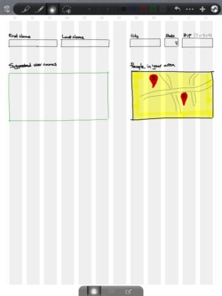
960px Portrait - has longer columns for designing in portrait mode;
-
960px Landscape - has wider columns (33% wider), better suited for drawing in landscape.
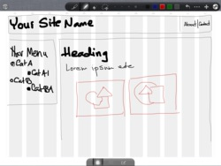
These two has been inspired by hellopanos’s templates for Penultimate, which I found too dark and thus distracting. Since the iPad has a great screen a lighter color is very visible and let’s the design take center stage while still providing alignment guidance. Space between columns is proportional to the width of the columns.
Since the design is performed within the constraint of the columns, I have chosen to indicate the outer/side border of the 960px grid with two faint lines. This way they are not distracting yet provide the visual indication of what the boundaries are.
iPad
Three iPad templates present an iPad that is scaled about 73% from the actual size (in pixels). FWIW, I even got the corner radius accurate and then I realized it doesn’t really matter that much.
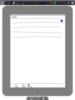
The screen portion displays the status bar (20px scaled by 0.73) and if you squint hard enough you’ll see marker lines for the 44pt navigation and 49pt tab bars. They are very faint so that they don’t distract from designing your interface, but still present if you want to make use of them.
Meeting Notes
Inspired by a Penultimate template, it contains a top section to record the date/time and place of the meeting, the subject/topic/reason for meeting, and the participants. This section doesn’t offer a great deal of space, but if you need more than that you’re probably doing something wrong or at least ineffectual.
The template devotes most of its body to the meeting notes and is concluded by a checklist-like section to record action items.
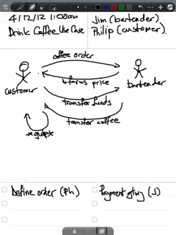
I gave each action item what I thought to be enough space, but you might want to consider writing in those sections using the GoodNotes magnifier mode.
Each section contains almost transparent text to indicate its purpose. I’ve thought it would be nice to provide such a hint, but I made it light enough so that it allows to write on top of it.
Task List
The task list template is geared toward being able to capture tasks quickly. That means that the space for each of the 14 lines is oversized so that you don’t have to use the magnifier mode.
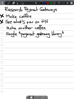
The lines are a bit darker than the other templates as they intend to provide more guidance for writing. There is white space at the top of the templates, enough to write a title for the task list, but not so much that it’s distracting it if you don’t.
If you look at the image by itself you might think there’s too much space at the bottom, but remember that GoodNotes has an area at the bottom where it displays the toolbar for bringing up the palm rest or magnifier. The template accounts for that.
ToDo List
The to-do template also has 14 rows of checkboxes but in two-column format as it’s designed for shorter entries. You can use the magnifier mode if you need to capture more details.
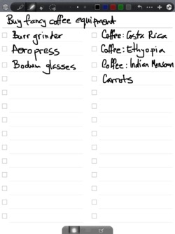
Since to-do lists are more likely to have a title, the template provides more emphasis by separating the title area from the checklist through a darker line, while at the same time the individual to-do entries have lighter supporting lines to allow more focus on the written text.
How to Import the Templates
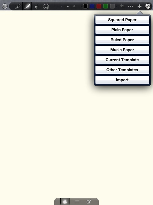
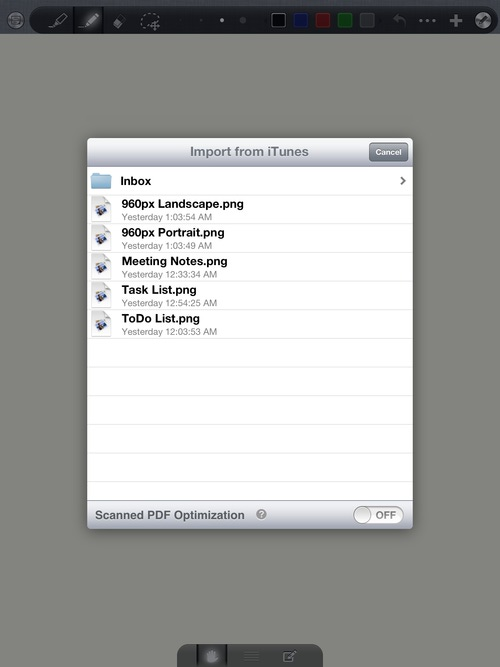
Using the images in GoodNotes is simple. Get the templates onto the device, then from within a notebook click the + button in the toolbar, click Import, select your image and go to town on it.
However, if you find yourself using one or more of the templates with some frequency, it might be worth going through the following five-step process to make them part of the template gallery.
-
Click on the + button in the toolbar and choose Import
-
Select your image from one of the image sources, depending on how you made available the templates to GoodNotes (in this case, I copied them to the app using iTunes).
-
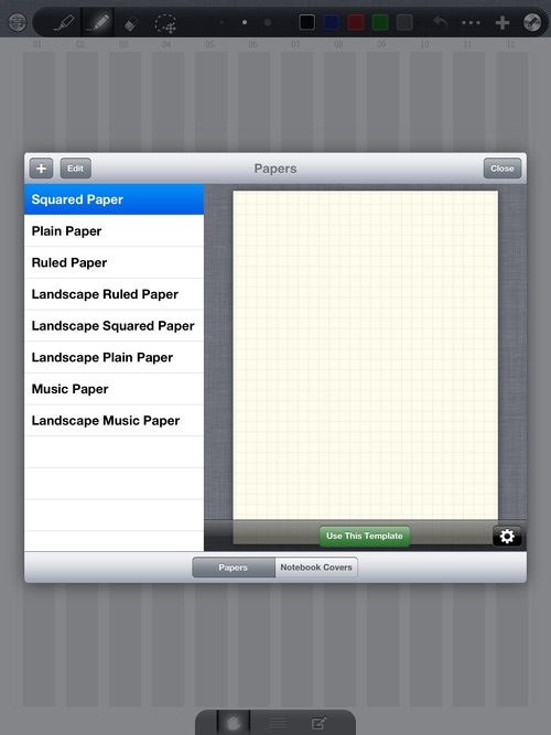
Repeat step 1: touch the + in the toolbar, but select Other Templates this time. You will be presented with the template selection dialog.
-
Click the + button in the top left corner of this dialog, then select Current Template.

-
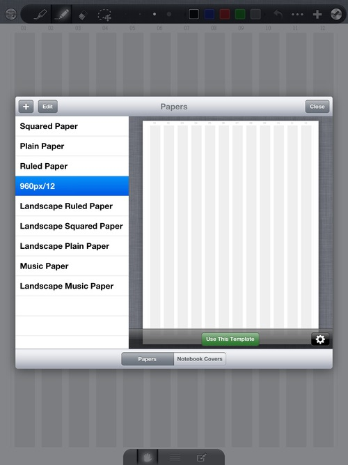
Give your template a recognizable name. Optionally, touch Edit then use the sizing chevron to move your template(s) in a better position.
Tech Notes
One of the decisions I made early on was to optimize these templates towards input (writing/drawing), which meant having to account for GoodNotes’s toolbar and palm-rest/magnifier. I could’ve started with a 768 x 1024 image to mimic the iPad’s screen, but I’ve noticed that GoodNotes moves the template down so that its top is right below the toolbar, effectively clipping its bottom part and thus reducing the effective area.
For this reason, the templates are actually 768 x 972, given that GoodNotes’s toolbar is 52 pixels high. The chevron that triggers the palm-rest/magnifier is 35 pixels high, so I designed all templates so that their bottom 40 pixels remains clear. I could’ve cropped the image and target 768 x 937, but I thought it looked better if the “paper” continued all the way to the bottom of the screen.
To create each template, I have started with a handcrafted SVG file and tweaked it for hours (mostly because I had no familiarity with SVG) until I got the desired result.
I then exported the images into PNG using OS X’s qlmanage and
ImageMagick’s convert and loaded them into GoodNotes to check out
the result and make sure the templates were comfortable to use.
Converting to PNG could’ve (should’ve) been a simple process because ImageMagick can convert SVG images, alas the feature-set support is limited, and occasionally, incorrectly implemented.
It would’ve been a great deal easier to create them in an image editor and, indeed, the first attempt was in Pixelmator and it took about 1/3 to half of the time it took to create the SVGs.
However, since the SVG files are text they are effectively the source code for the templates, something I can certainly appreciate as a software engineer.
As a bonus, you need but a text editor to quickly change their dimensions and create templates for another note taking app (e.g. Penultimate).
Where to Get Them
The templates are on github and the SVG files are within the source folder of that repository. If you’re interested only in the PNG files, I’ve uploaded a zip file that contains them all.
The templates, both PNG and SVG files, are released under a Creative Commons BY-NC-SA license, which means you are free to share them and change (remix) them, but you cannot sell them, you must give proper attribution, and should you alter them you may distribute the resulting work only under the same license (or similar).
That being said, have fun hacking them. Looking forward to it.